Patterns
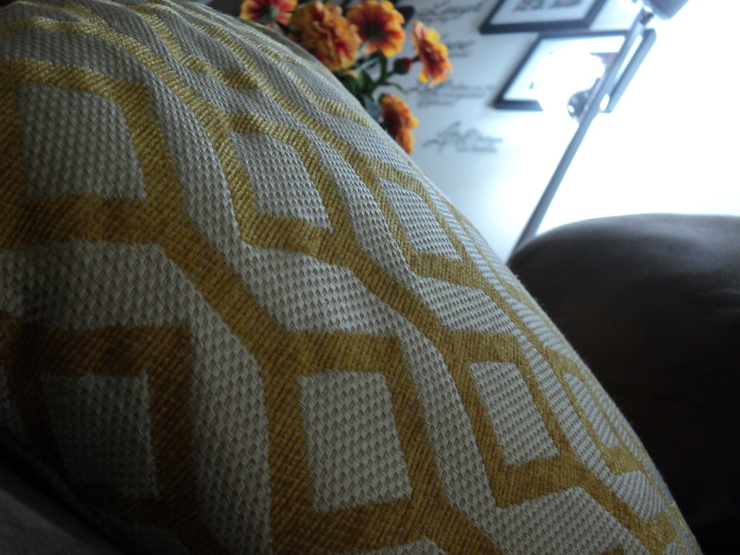
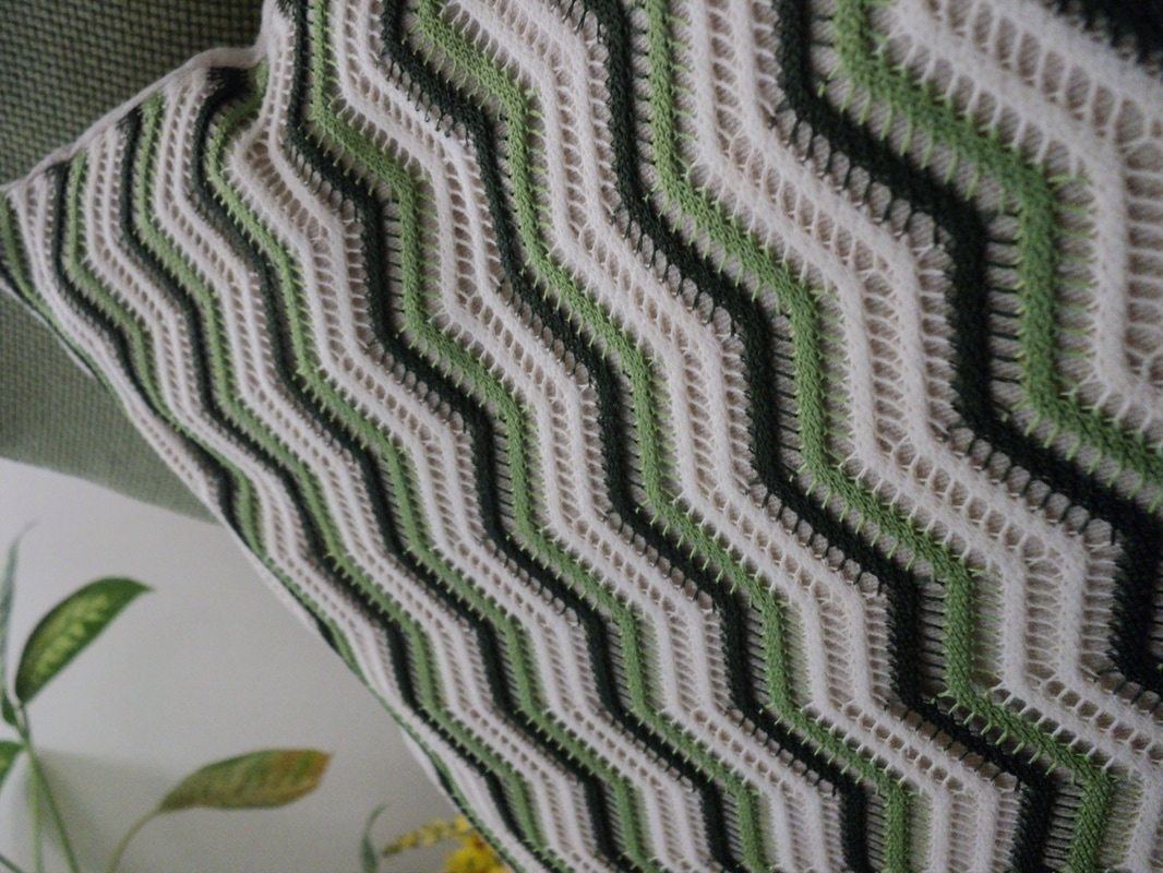
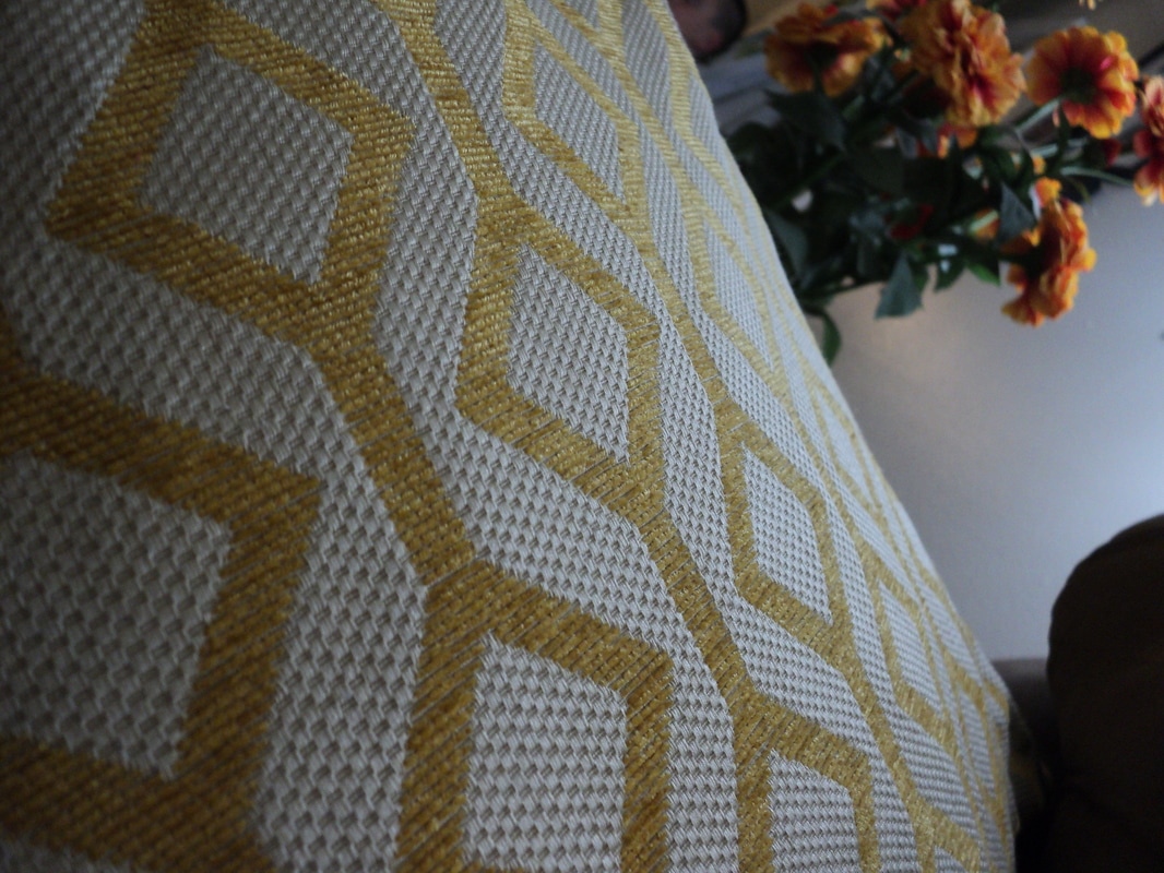
I chose these three photos because they have really good patterns and vivid colours to them. There is a good balance between the black and white colours, the shadows, and the background. In the first picture I adjusted the temperature and I made sure to have lens correction. I as well added a little of camera calibration to make the yellow pattern pop so the colours are more clear. In the second photo i adjusted the temperature to make the black and whites visible and balanced. I as well lens corrected it. In the third photo I played around with the clarity and made it seem more clearer for the viewers. I really like the first photo because it has a good balance between the whites and the shadows and the brings out the clarity in the patterns. The background makes it more calmer and better looking.
Glasses and Bottles
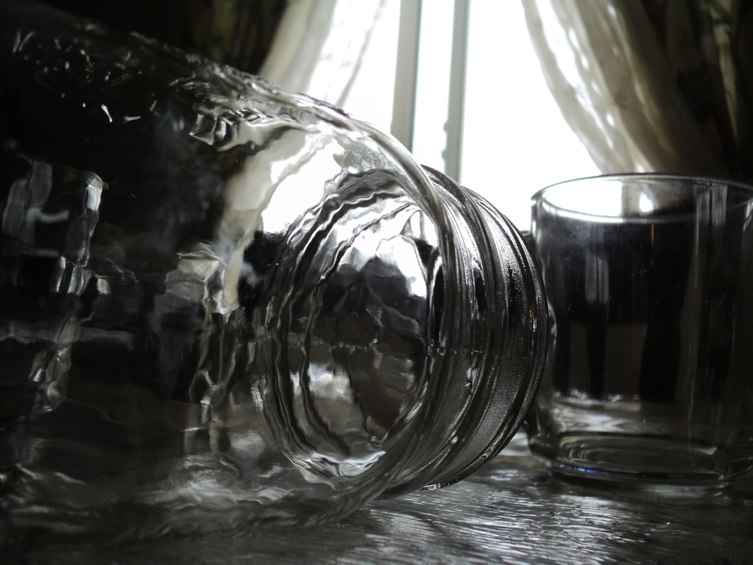
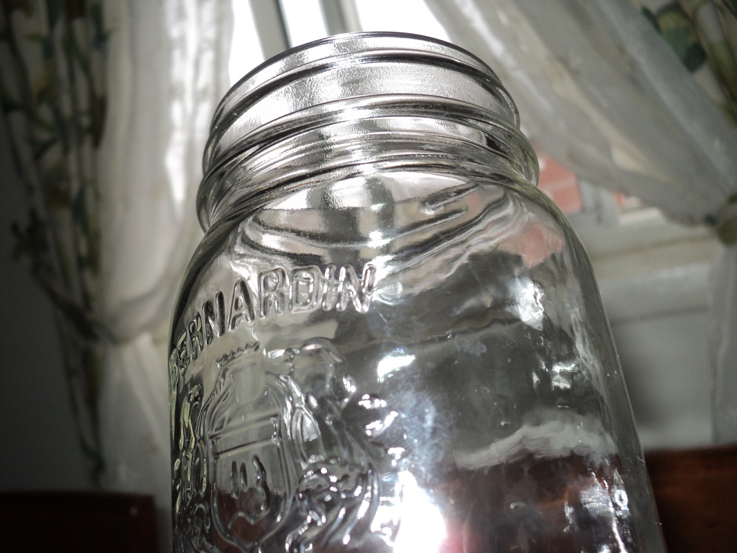
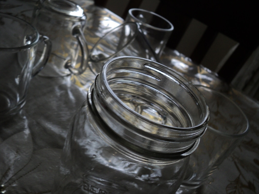
In the first photo i adjusted the whites and blacks of the photo and I lens corrected to make it fit and have better quality. The glass bottle on the left of the photo makes this photo great because the art of it looking through the glass makes the whole picture better and it is one of my favourites. The lights and shadows make the glass pop out and redirect people eyes to the glasses. In the second photo I tried to centre the glass bottle so viewers can focus on the centre. I adjusted the lights in the background as well to give the glass bottle a little shine. The last photo I adjusted the white balance and the shadows because the picture was very dim. I also adjusted it with the rule of thirds grid to make it closer and focus more on the bottles in the picture.
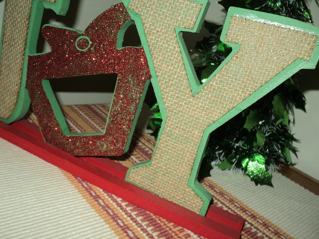
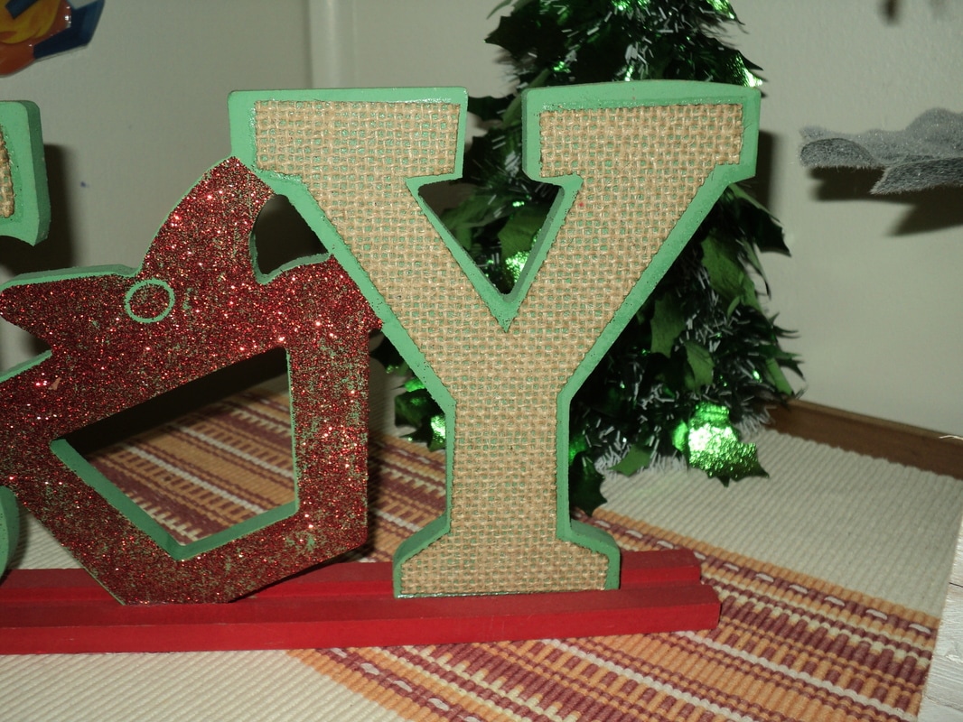
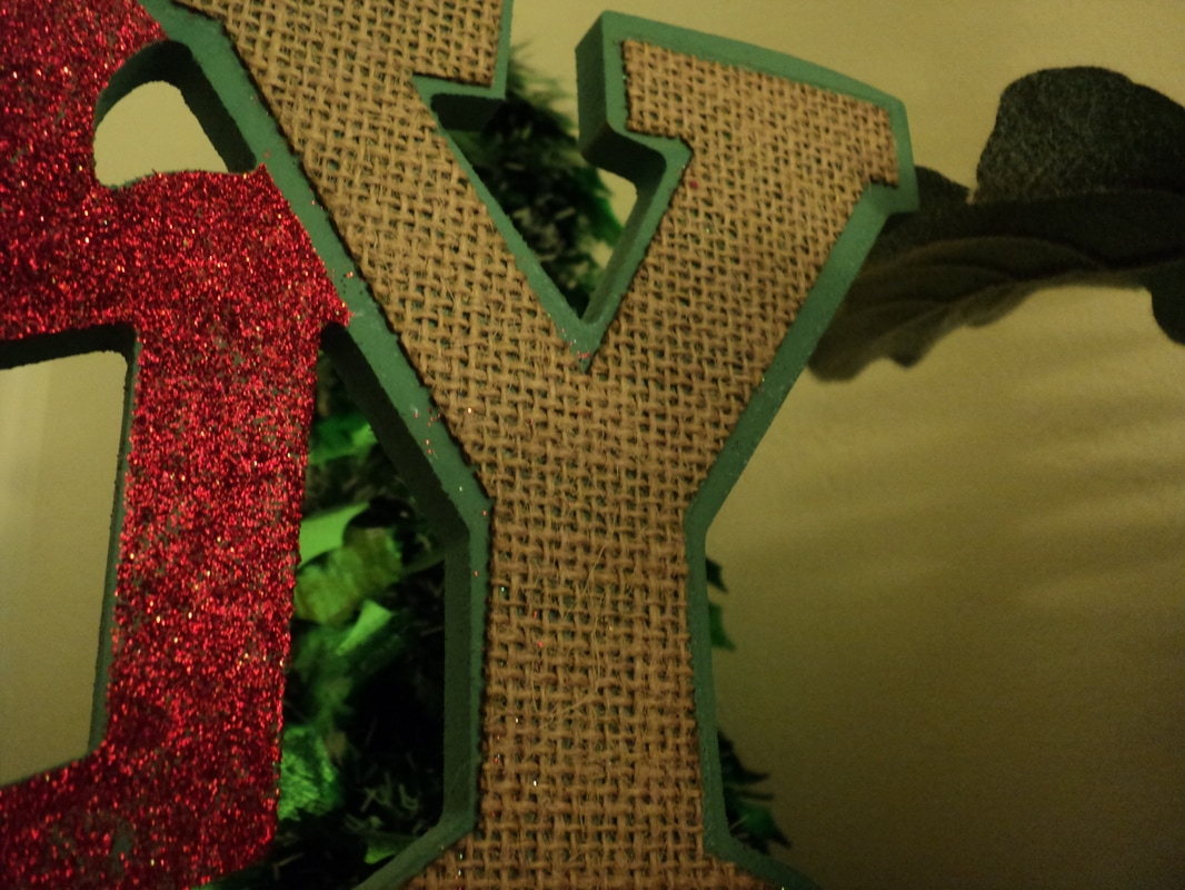
First Letter
|
|
|
In the first photo I took the picture with the flash on, this helped to show the things in the background and around the photo because the background was dark. I adjusted the white balance and used the rule of thirds grid to make this photo look good. In the second photo I tried to center the letter to give it maximum exposure, and I adjusted the white balance and made shadows darker. The last photo is without flash and you can see the difference that the flash makes in photos. In the last photo I tried to white balance and bring the colour out.
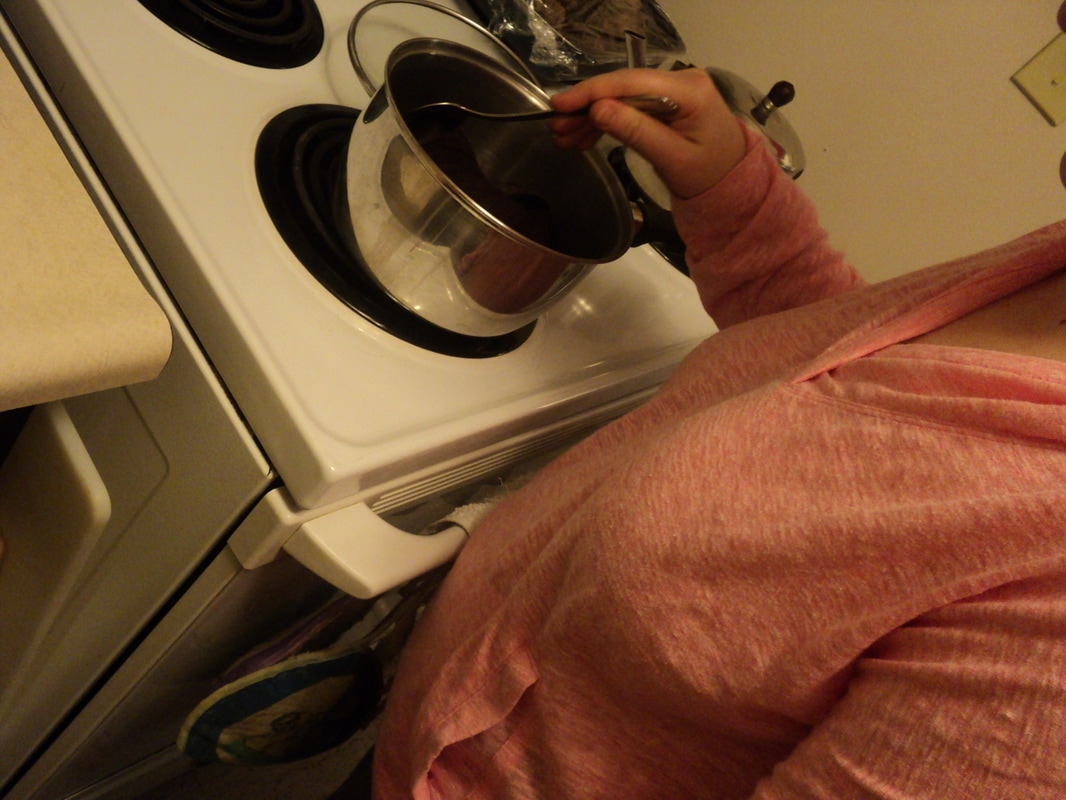
Hands
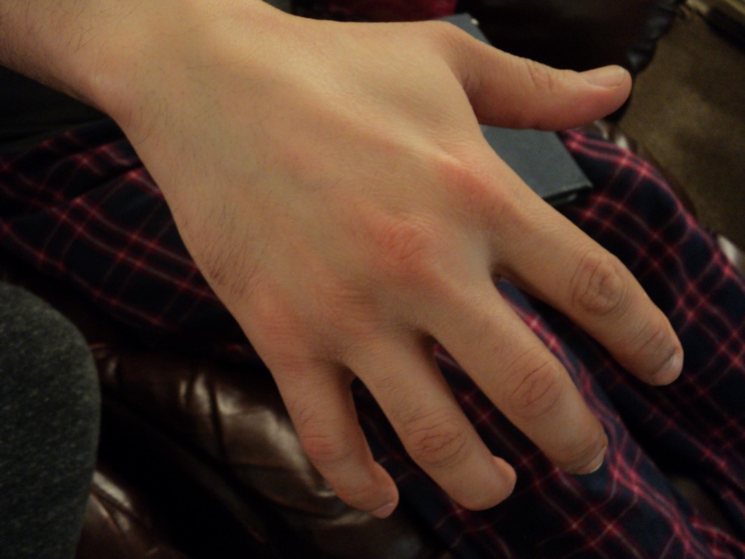
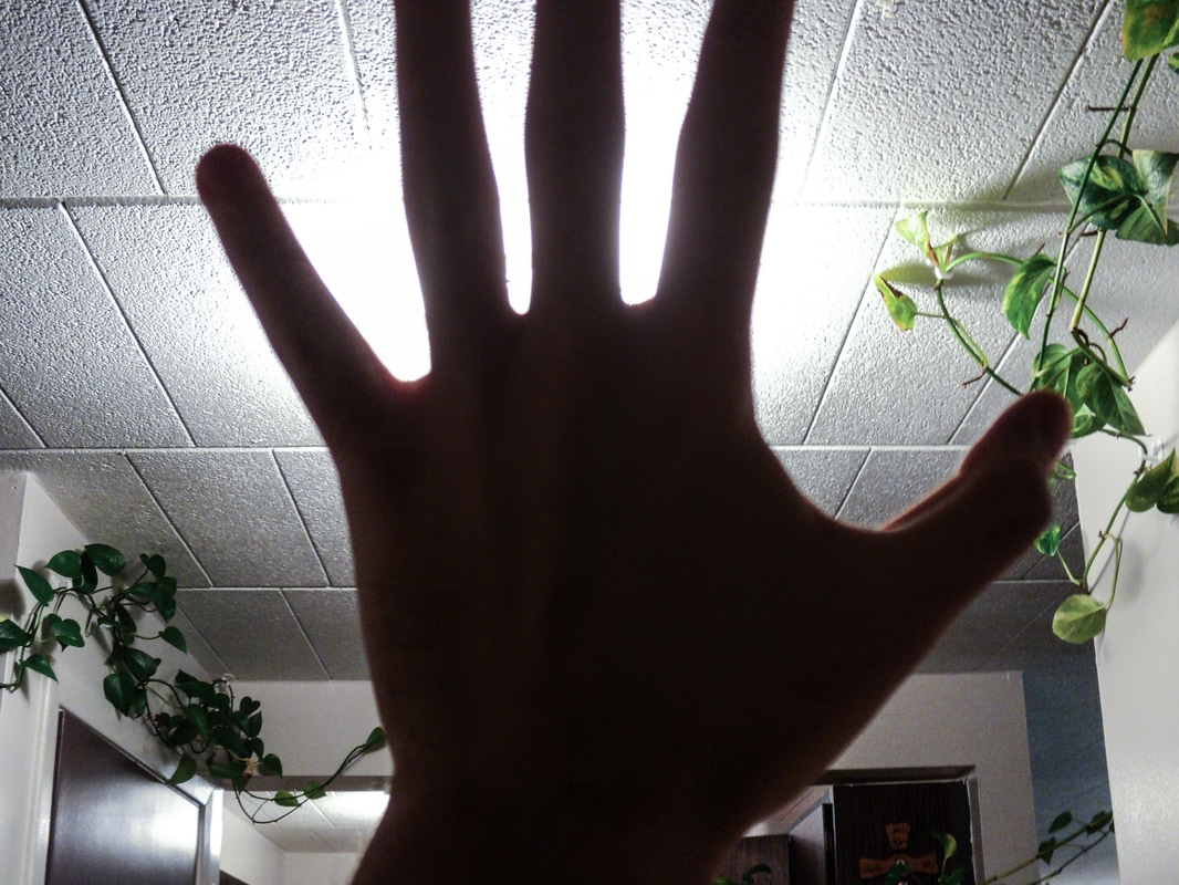
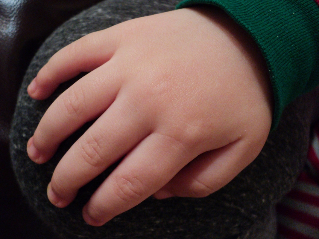
In the first picture I adjusted the white balance to not make the photo seem shady, I also adjusted the the grid of the photo and lens corrected it. The colour of the hand makes the background pop out. In the second photo there was a debate whether to use or not use flash, but the best choice was not to use because that would make the whole photo white. I didn't white balance this photo because there was enough white in the photo and that would disrupt the picture. The last photo is my favorite because everything goes really well together, all the colours, the shadows, lights, etc. I did not adjust anything in this photo.
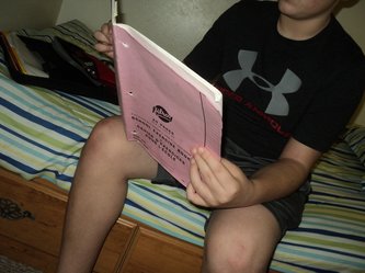
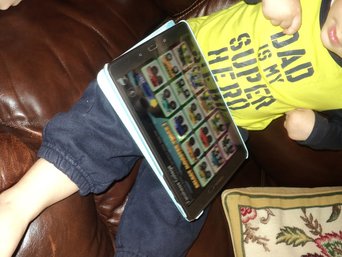
Detail Portrait
|
|
|
In these pictures the detail portraits focus on a task or a thing that they are doing. In these pictures I white balanced them, did a rules of third grid on them, lens corrected them, I applied teeth whitening tool on a couple of parts on these pictures and I balanced the shadows and clarity in them.
